How Color Affects Your Mood at Home
Have you ever walked into a room and instantly felt calm, cozy, energized, or even a little uncomfortable?
Color may be part of the reason.
The colors in your home can affect how a space feels before you even notice the furniture or decor. Warm colors tend to feel lively and inviting, while cool colors usually create a more peaceful atmosphere.
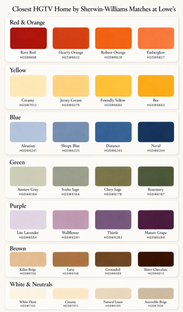
Here’s a simple guide to what different colors can bring to a room. You can see all the color suggestions at the bottom on the chart!!
Red & Orange: Warm and Energizing
Red and orange add warmth, energy, and personality.
Softer shades such as terracotta, rust, brick, and clay are often easier to decorate with than bright red or orange.
Best for: dining rooms, breakfast nooks, family rooms, and accent areas.
Yellow: Cheerful and Bright
Yellow can make a room feel sunny, happy, and welcoming.
Soft buttery yellows and creamy gold tones work especially well in spaces that need a little extra warmth.
Best for: kitchens, breakfast areas, laundry rooms, and small accents.
Blue: Calm and Relaxing
Blue is one of the most popular choices for creating a peaceful room.
Soft blues feel restful, while deeper shades such as navy can add sophistication and depth.
Best for: bedrooms, bathrooms, offices, and cabinetry.
Green: Balanced and Natural
Green feels comfortable because we naturally associate it with the outdoors.
Muted shades such as sage and olive can add color without overwhelming a room.
Best for: kitchens, bedrooms, offices, hallways, and living rooms.
Purple: Soft or Luxurious
Purple can create very different moods depending on the shade.
Lavender feels soft and relaxing, while plum and eggplant can make a room feel rich and dramatic.
Best for: bedrooms, reading corners, dens, and powder rooms.
Brown: Warm and Grounding
Brown adds warmth and helps a room feel cozy and finished.
You don’t necessarily need brown walls. Wood furniture, leather, woven baskets, rattan, and natural textures can bring the same effect.
Best for: living rooms, offices, and neutral spaces that need more warmth.
White & Neutrals: Light and Airy
White, cream, beige, and taupe can make a space feel open and fresh.
The trick is adding texture so the room doesn’t feel flat. Try wood, linen, plants, woven baskets, and soft fabrics.
Best for: living rooms, bedrooms, bathrooms, and open spaces.
Choosing Colors Room by Room
A few easy starting points:
Bedroom: blue, sage, lavender, or warm neutrals
Kitchen: cream, yellow, sage, or muted blue
Dining Room: terracotta, deep green, rust, or navy
Living Room: warm white, beige, taupe, or soft green
Bathroom: blue, sage, or warm white
Office: navy, olive, green, or blue-gray
Always Test Your Paint First
Paint colors can look completely different depending on natural light, artificial lighting, flooring, furniture, and even the time of day.
Before painting an entire room, test a large sample and look at it in the morning, afternoon, and evening.
Quick Color & Mood Guide
Red & Orange: Energizing and social
Yellow: Cheerful and uplifting
Blue: Calm and restful
Green: Balanced and natural
Purple: Relaxing or luxurious
Brown: Warm and grounding
White & Neutrals: Light and airy
Before choosing your next paint color, ask yourself one simple question:
How do I want this room to feel?
That can make choosing the perfect color much easier.