
💖Some of these links contain affiliate links which means I may get a commission-but this is no additional cost to you!!
How Color Affects Mood in Interior Design, Room by Room🎨
Have you ever walked into a room and immediately felt relaxed, energized, cozy—or even a little uncomfortable?
Additionally, this is related to How Paint Affects Your Mood.
Sometimes it’s the furniture. Sometimes it’s the lighting.
But very often, it’s the color.
I love using color in a home because paint is one of the easiest and most affordable ways to completely change how a room feels. You don’t necessarily need new furniture, new floors, or an expensive renovation.
Sometimes a gallon of paint and a few new accessories can make you fall in love with your room again.
And here’s the best part:
There really isn’t one “perfect” color for every home.
The right color, How Paint Affects Your Mood, works with your lighting, your furniture, and your style. Moreover, it should also reflect how you want the room to feel.
Check out your style by clicking HERE!!! Many may just give you inspiration!!!!
Before You Pick a Paint Color, Look at the Light💡
This is probably one of the most important things I can tell you about choosing paint.
The same paint color can look completely different from one room to another.
Natural light changes throughout the day, and that can completely change the way a color appears.
A room with very little natural light may make certain blues look gray or make a darker color feel even heavier.
A sunny room can make warm colors look brighter and more intense.
And once the sun goes down, your lamps and light bulbs change the color all over again.
Oh Lala Tip:
Before painting an entire room, put a large paint sample on more than one wall.
Look at it:
- In the morning
- In the afternoon
- At night
- With your lights turned on
Live with it for a couple of days before deciding.
That tiny paint chip in the store simply cannot show you exactly how that color will look on four walls.
Red: Energy, Warmth & Drama⚡
To see an entry way that will energize your visitors CLICK HERE
How Paint Affects Your Mood shows that red is not a shy color.
Moreover, it signals bold energy.
It brings warmth, energy, and attention into a room.
That’s why you’ll often see shades of red used in dining rooms, kitchens, entryways, and entertaining spaces.
But you don’t have to paint an entire room bright red to get the effect.
I personally love the softer, more livable versions.
Think:
- Brick red
- Burgundy
- Rust
- Clay
- Terracotta
- Muted cranberry
These colors still give you warmth without completely taking over the room.
If you love red but aren’t ready for red walls, bring it in through pillows, artwork, rugs, lamps, flowers, or one beautiful accent chair.
Best for: Dining rooms, entryways, entertaining spaces and accent areas.
Orange: Cozy, Social & Welcoming🥰
Orange can also be a very Happy, energizing color-CLICK HERE
Orange can make a room feel incredibly warm and inviting.
And I’m not talking about bright pumpkin orange everywhere.
There are so many beautiful versions of orange that work wonderfully in decorating.
Think:
- Terracotta
- Burnt orange
- Peach
- Clay
- Cinnamon
- Copper
These shades pair beautifully with creams, warm whites, wood tones, greens, navy, and even soft blues.
Orange works especially well in rooms where people gather because it creates a cozy, friendly feeling.
Best for: Family rooms, dining rooms, kitchens and cozy gathering spaces.
Yellow: Happy, Bright & Cheerful😁
See this pin, and how suddenly it affects your mood CLICK HERE
Yellow is one of those colors that can instantly make a space feel happier.
Soft buttery yellows can be beautiful in kitchens, breakfast areas, sunrooms, laundry rooms, and even bathrooms.
But yellow is also one of those colors where a little can go a long way.
A bright lemon yellow might look gorgeous on a paint chip but become overwhelming on four walls.
If you love stronger yellow, try adding it through:
- Flowers
- Artwork
- Pillows
- Kitchen accessories
- A small piece of furniture
- Decorative accents
You can always add more.
Oh Lala Tip:
If a bold color makes you nervous, decorate with it before you paint with it.
It’s much easier to move a yellow vase than repaint a yellow living room!
Blue: Calm, Peaceful & Relaxing😌
See how this blue can make you automatically feel relaxed CLICK HERE
There’s a reason blue is so popular in bedrooms and bathrooms.
It tends to create a calm, peaceful feeling.
Soft blues can make a bedroom feel restful while darker shades like navy can add sophistication and drama.
Some of my favorite ways to use blue are:
- Soft dusty blue bedroom walls
- Navy kitchen cabinets
- Blue bathroom vanities
- Blue accent chairs
- Blue and white decor
- Blue-green coastal shades
Just be careful in rooms with very little natural light.
Some blue paints can suddenly look much grayer than expected.
Best for: Bedrooms, bathrooms, offices and relaxing living spaces.
Green: Balanced, Natural & Easy to Live With⚖️
See a Green & Gold room CLICK HERE
If you want to add color but you’re afraid you’ll get tired of it, green is one of the first colors I would look at.
Green almost acts like a neutral because we’re so used to seeing it in nature.
Some beautiful choices include:
- Sage
- Olive
- Eucalyptus
- Moss
- Dusty green
- Blue-green
Green works beautifully with wood, cream, beige, black, brass, white, terracotta and natural textures.
That’s one reason sage and olive have become so popular.
They add personality without screaming for attention.
Best for: Living rooms, bedrooms, kitchens, offices and entryways.
Oh Lala Tip:
If you want to try a bolder color for the first time, a muted green is one of the easiest places to start.
Purple: Creative, Cozy & Unexpected🤭
Depending on the shade of purple, it can be an happy and energizing color-or it can be cozy- CLICK HERE to see COZY CLICK HERE to see UNEXPECTED
Purple sometimes gets overlooked in home decorating, but the right shade can be absolutely beautiful.
Deep plum can feel rich and dramatic.
Soft lavender can feel peaceful and romantic.
Dusty purple and mauve can add warmth without feeling overly feminine.
Try pairing purple with:
- Cream
- Warm white
- Gray
- Natural wood
- Brass
- Soft green
- Black accents
Best for: Bedrooms, reading areas, offices and accent spaces.
White & Beige: Calm Doesn’t Have to Mean Boring😌
These colors can be mixed with decor that make your home warm and calm, but also adding a mix of Oh Lala – CLICK HERE
I know neutral homes are popular, but here’s the thing:
Neutral does not have to mean boring.
A white or beige room can be absolutely beautiful when you give it texture and personality.
If your walls are neutral, bring interest into the room with:
- Wood tones
- Woven baskets
- Plants
- Artwork
- Books
- Black accents
- Beautiful lighting
- Textured pillows
- Throw blankets
- Rugs
- Fresh flowers
One strong accent color can completely change a neutral room.
The problem isn’t beige.
The problem is when everything is beige and nothing stands out.
Warm Colors vs. Cool Colors
If you’re completely overwhelmed standing in front of hundreds of paint chips, start here.
Ask yourself:
Do I want this room to feel warm and energetic—or cool and relaxing?
Warm Colors
Warm colors tend to feel cozy, cheerful, and social.
Think:
- Red
- Terracotta
- Orange
- Peach
- Yellow
- Warm beige
- Brown
- Warm wood tones
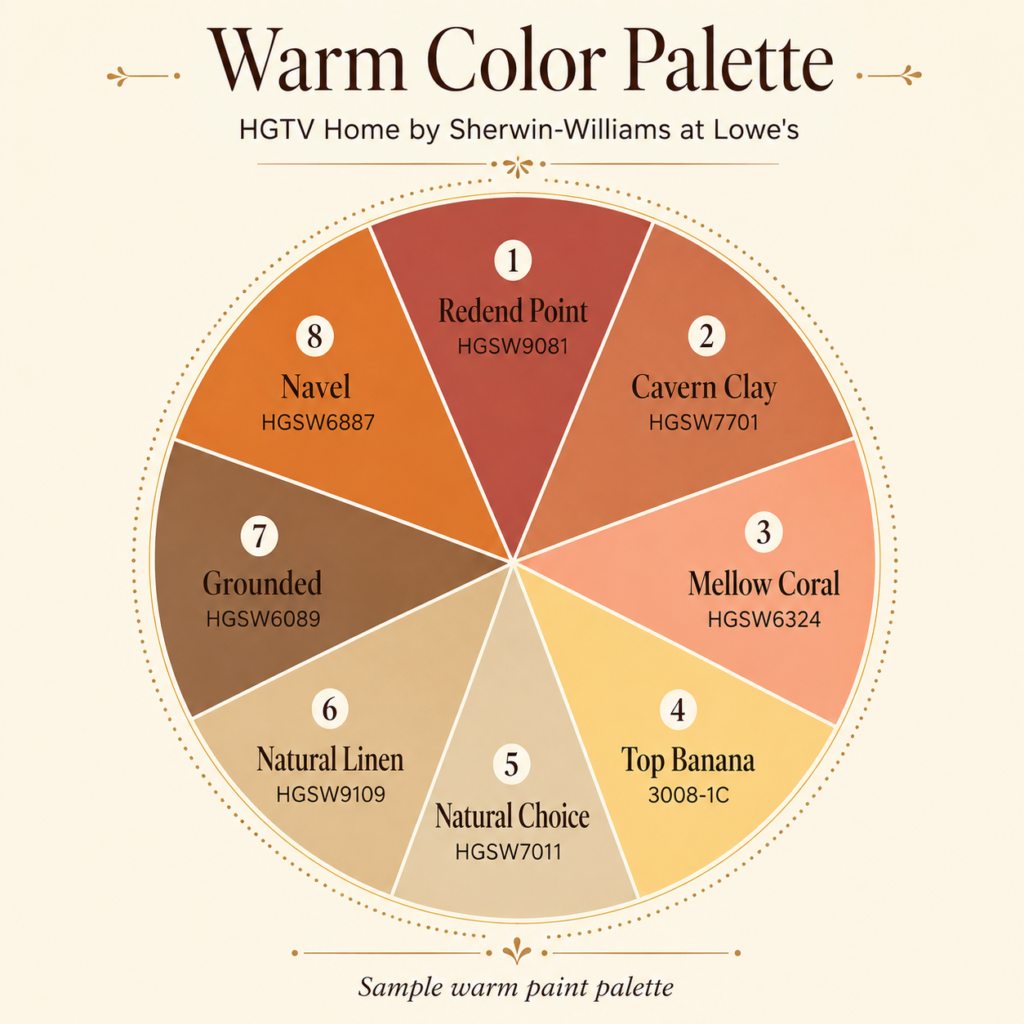
They can work especially well in dining rooms, kitchens, family rooms and entertaining spaces.
Cool Colors
Cool colors tend to feel calm, restful, and peaceful.
Think:
- Blue
- Navy
- Sage
- Olive
- Blue-green
- Lavender
- Cool gray
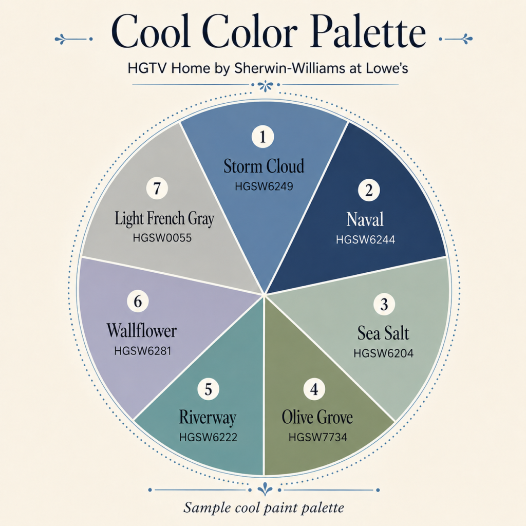
They can be beautiful in bedrooms, bathrooms, offices and quiet living spaces.
And then there’s white.
White can lean either warm or cool.
A creamy white can feel soft and welcoming while a very cool white can feel much crisper and more modern.
That little undertone makes a HUGE difference.
Choose Your Color Based on the Room
Follow this link to see colors in rooms CLICK HERE
Here’s an easy starting point.
Living Room
Try:
- Sage
- Warm cream
- Soft blue
- Terracotta
- Olive
- Warm greige
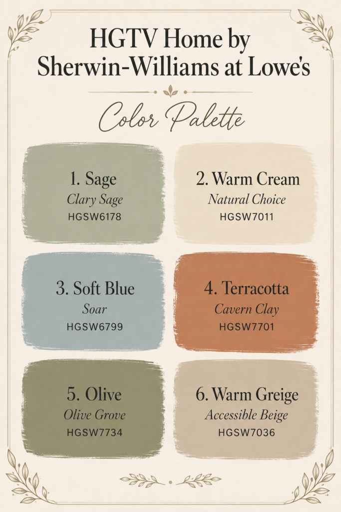
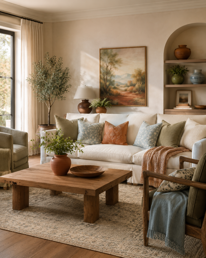
You want a living room to feel welcoming and comfortable.
Bedroom
Try:
- Dusty blue
- Sage
- Lavender
- Soft green
- Warm white
- Muted blue-gray
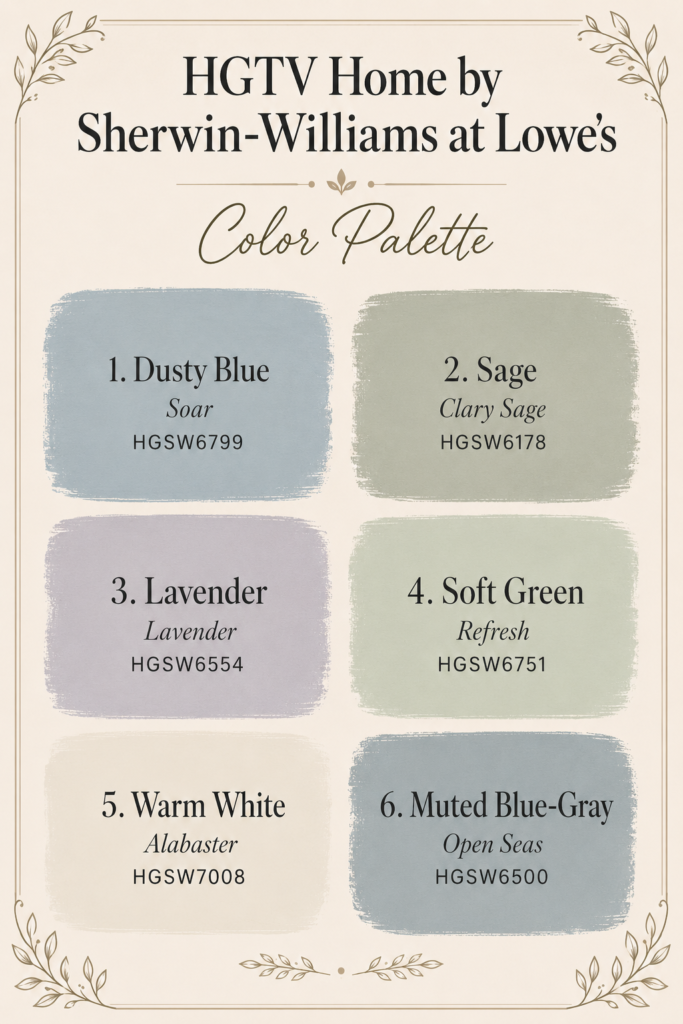
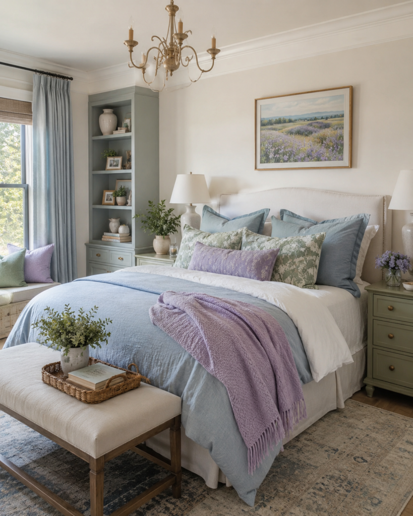
Bedrooms usually work best with colors that help the room feel calm and restful.
Kitchen
Try:
- Warm white
- Soft yellow
- Sage
- Blue-green
- Cream
- Navy accents
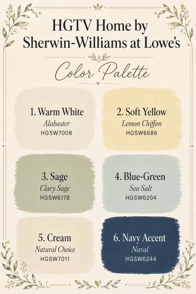
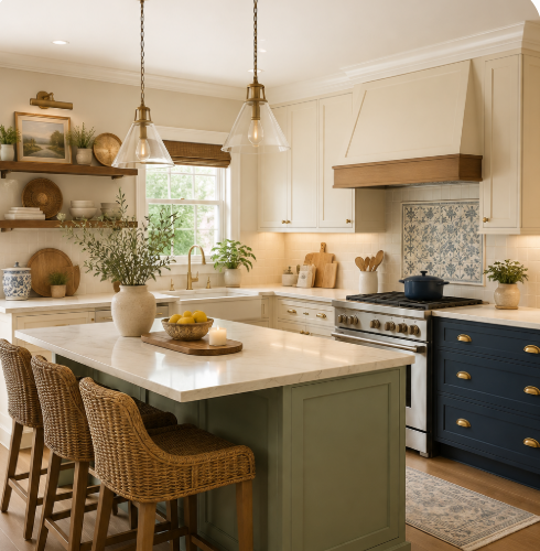
And remember—you don’t have to put the color on the walls.
Your cabinets or island can become the color statement instead.
Bathroom
Try:
- Pale blue
- Soft green
- Warm white
- Blue-green
- Cream
- Muted lavender
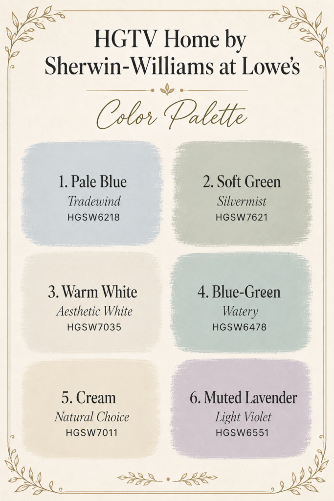
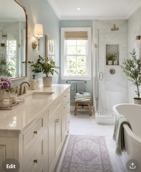
Bathrooms are a great place to experiment with color because they are usually smaller spaces.
Dining Room
Try:
- Terracotta
- Burgundy
- Olive
- Navy
- Warm beige
- Deep green
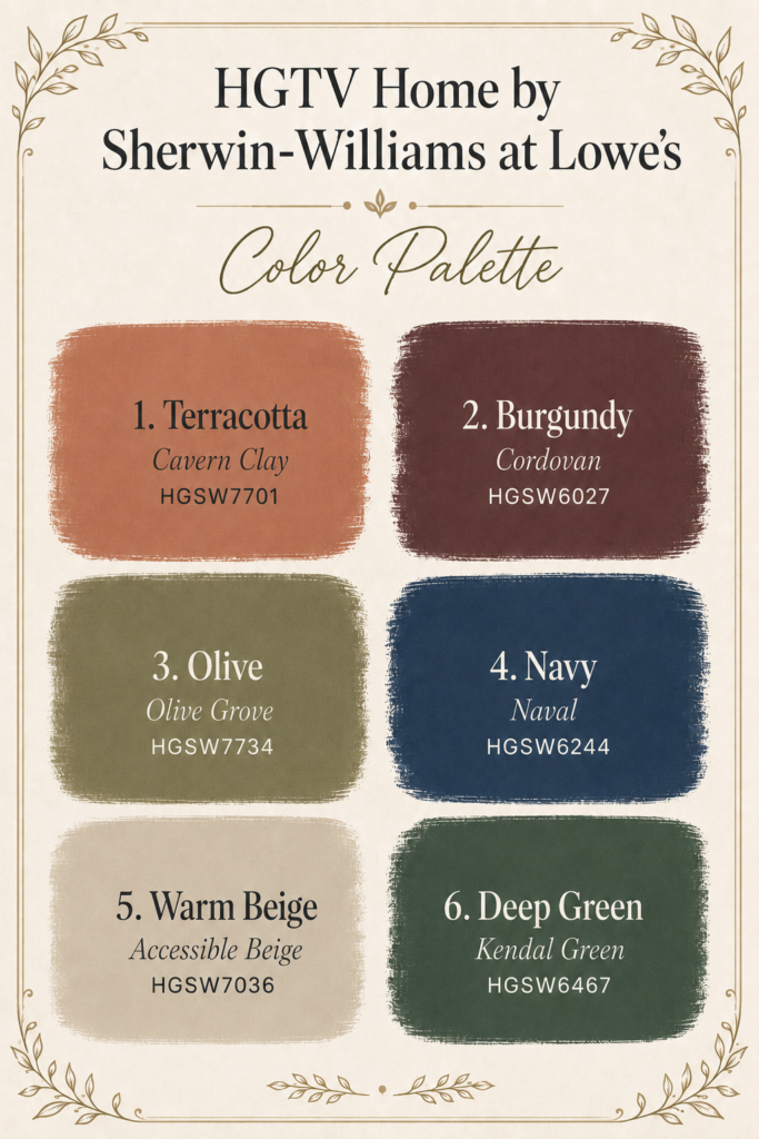
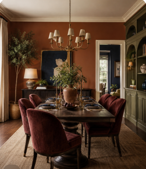
Dining rooms can handle a little more drama.
Home Office
Try:
- Green
- Blue
- Navy
- Warm neutral shades
- Muted earthy colors
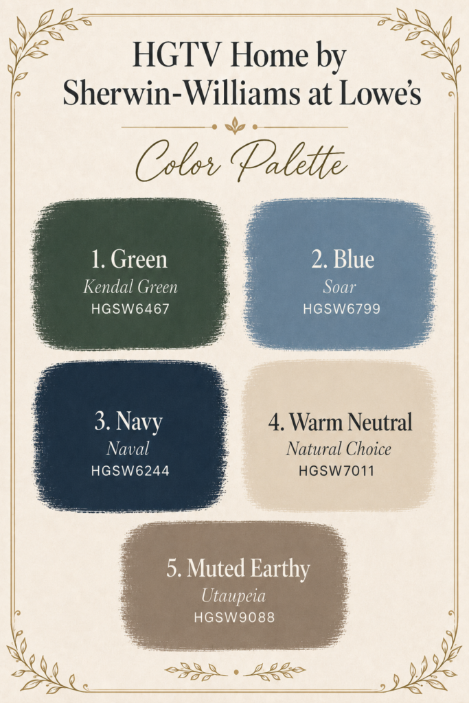
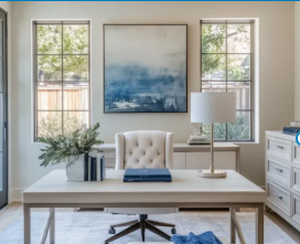
Choose something that makes you feel comfortable but still able to focus.
Don’t Forget the Furniture You Already Own
This is another mistake I see people make.
They find a paint color they love and then try to make everything else work around it.
Instead, look at the things in your room that are staying.
Your:
- Sofa
- Flooring
- Countertops
- Cabinets
- Rug
- Curtains
- Large furniture
Those items should help guide your paint choice.
Paint is much easier and less expensive to change than a sofa or flooring.
Oh Lala Tip:
Decorate around the expensive things you already own—not the paint chip.
Want a Small Room to Feel Bigger?
READ THIS!!👉👉 10 Common Mistakes That Make Your Home Feel Smaller
Color can help here too.
If a room feels small or dark, try using:
- Light warm whites
- Soft cream
- Pale beige
- Light blue
- Soft green
- Pale greige
Then keep some of the larger pieces in a similar color family.
When there is less contrast between the walls and furniture, your eye moves through the room more easily and the space can feel more open.
That doesn’t mean everything has to be white.
It simply means you want the room to feel connected instead of chopped into lots of different colors.
Your Home Does Not Have to Look Like Everyone Else’s
Pinterest and Instagram are wonderful for inspiration, but sometimes we see the same rooms over and over again. Check out my PINTEREST PAGE for so many color combinations and inspiration
If you love color, use color.
If you love neutrals, use neutrals.
If you want a turquoise chair, get the turquoise chair.
If that strange vintage table makes you smile every time you walk past it, that’s probably exactly what your room needs.
You can still think about resale and make smart choices with expensive permanent finishes.
But paint? Paint can be changed. Your home should be a place you actually enjoy living in now.
One Last Oh Lala Tip
Before choosing a paint color, ask yourself one simple question:
How do I want to feel when I walk into this room?
Do you want it to feel:
Calm?
Look toward blues, greens and soft neutrals.
Warm and cozy?
Try terracotta, cream, warm beige and earthy colors.
Happy and cheerful?
Bring in yellow, peach and brighter accents.
Rich and dramatic?
Try navy, burgundy, deep green or plum.
Light and airy?
Use soft whites, creams and pale colors with plenty of natural texture.
There really are no rules saying your entire house has to be beige—or that every room has to follow the latest trend.
Start with your light.
Look at what you already own.
Choose the feeling you want.
Then test the paint before committing.
Because sometimes one beautiful color is all it takes to completely change the way you feel about your home.
Looking for More Home & Paint Inspiration?
At Oh Lala Great Deals & Finds, I’m always looking for ways to make a home look beautiful without spending a fortune.
From paint color inspiration and decorating ideas to affordable home finds and simple tricks that can completely change a room, there are so many ways to create a home you love on a real-life budget.
Follow this link to see color inspirations CLICK HERE
For all My OH LALA Posts CLICK HERE
